
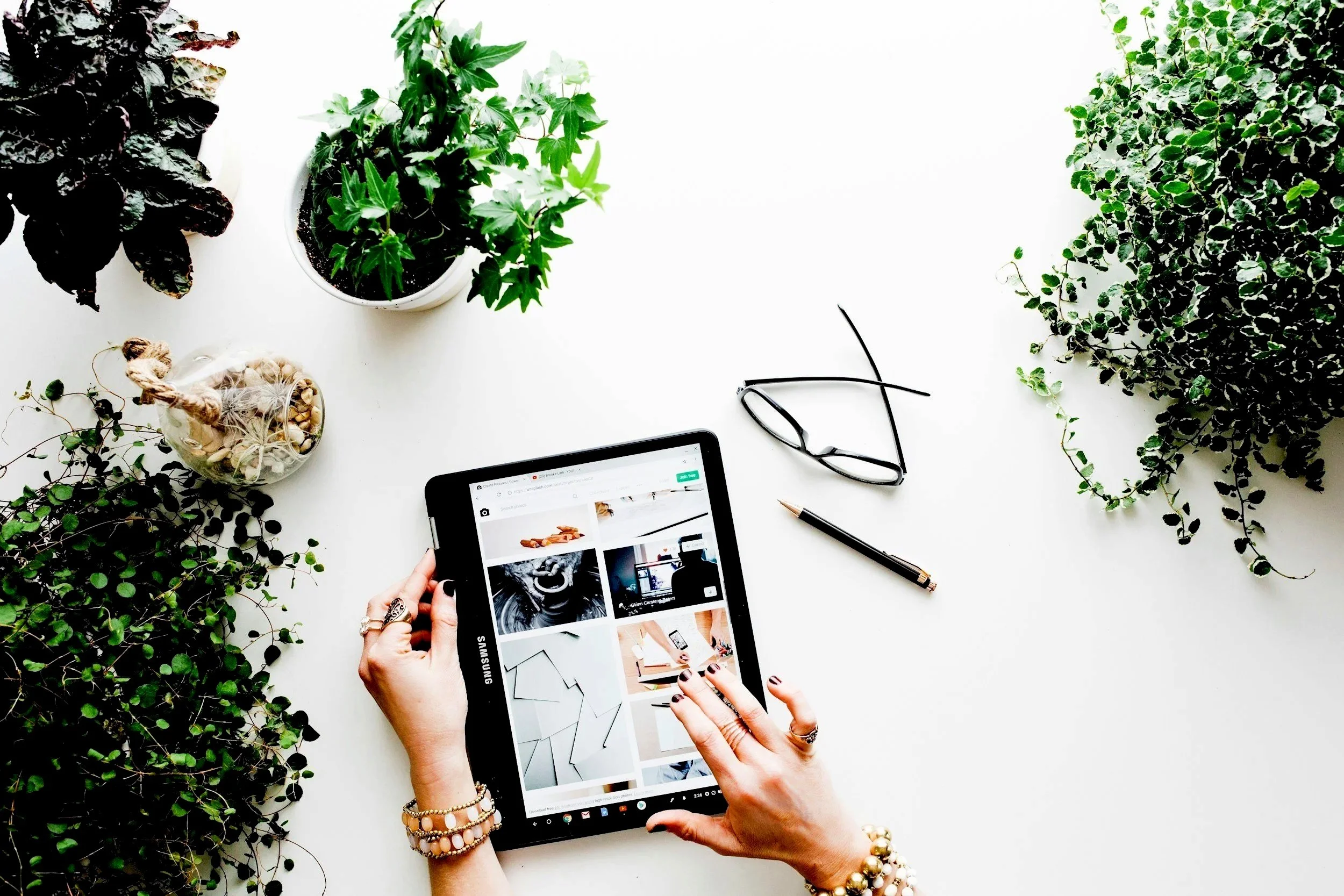
Hi, I’m Emily
I work with businesses to help them create beautiful and effective websites. No jargon or gimmicks. Just a proven framework that your audience will love.
Specialising in, and combining, Web Design, Copywriting & Branding.

Web Design Trends to Consider in 2026
(and which ones to avoid?)…Trends. We are all intrigued by them, whether they are for fashion, travel, wellness or our businesses.
The tech world certainly loves talking about trends. But what actually matters with our websites, and just how trendy do they need to be? The ultimate goal is to have a website that works for your business. One that converts visitors into enquiries and communicates clearly what you do and who you help.
As we move into 2026, I'm seeing some distinct aesthetic shifts - the look and feel of websites is changing in some interesting ways. Some of these trends have the potential to genuinely enhance how your brand is perceived, while others seem like a fad and may expire quickly.
In this article, I'll walk you through the design trends I'm leaning into this year, as a web designer. More importantly, I'll help you understand which ones might be right for your business, which you can confidently ignore, and how to make decisions about your website design that go beyond simply chasing what's fashionable.
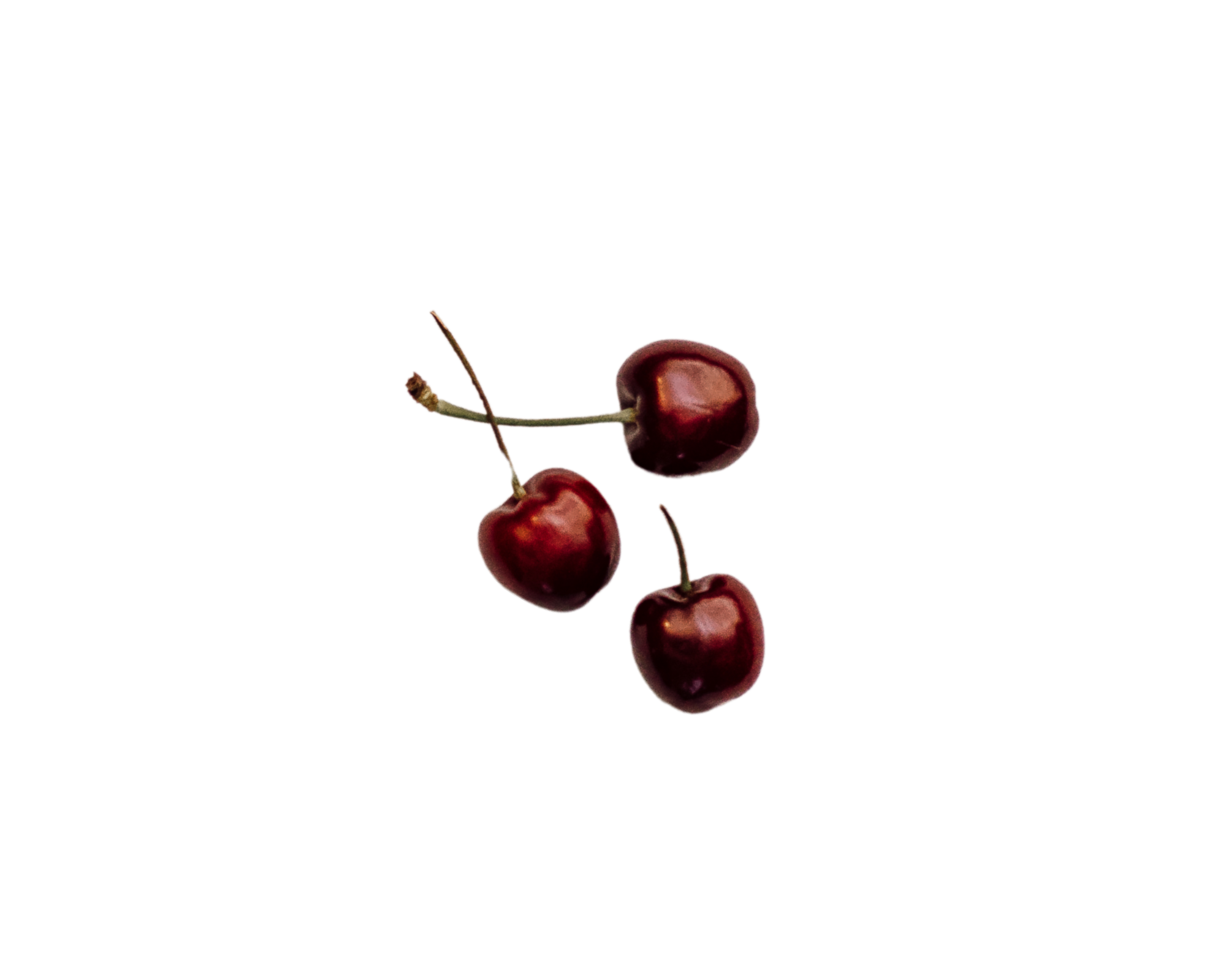
Moody, Rich, Saturated Tones
What it is: Trends are moving away from light, bright airy aesthetics towards deep forest greens, burgundies, terracotta, navy blues and warm browns. Rich, saturated colours that create atmosphere and depth.
Why it's happening now: It seems we’re tired of the pale pink and mint green look that dominated 2019-2022. The pendulum is swinging back toward richness and warmth. There's also a cultural shift toward comfort as these colours feel enveloping and sophisticated, rather than clinical.
Should you care? It depends on your brand personality. If you're a luxury service provider, premium consultant or established business wanting to convey depth and expertise, these richer tones work beautifully. They signal sophistication and confidence.
But if your brand is genuinely about lightness and energy - if that's authentically you - don't force a moody rebrand. A children's party planner or energetic fitness coach might struggle work with colours such as burgundy and forest green.
Real-world application: A financial advisor could move from corporate blue and white to sophisticated deep teal with warm charcoal - instantly feeling more premium. A therapist specialising in rest might embrace rich burgundy and sage green to create a calming feeling. A brand strategist could use deep navy and terracotta to communicate both professionalism and creativity.

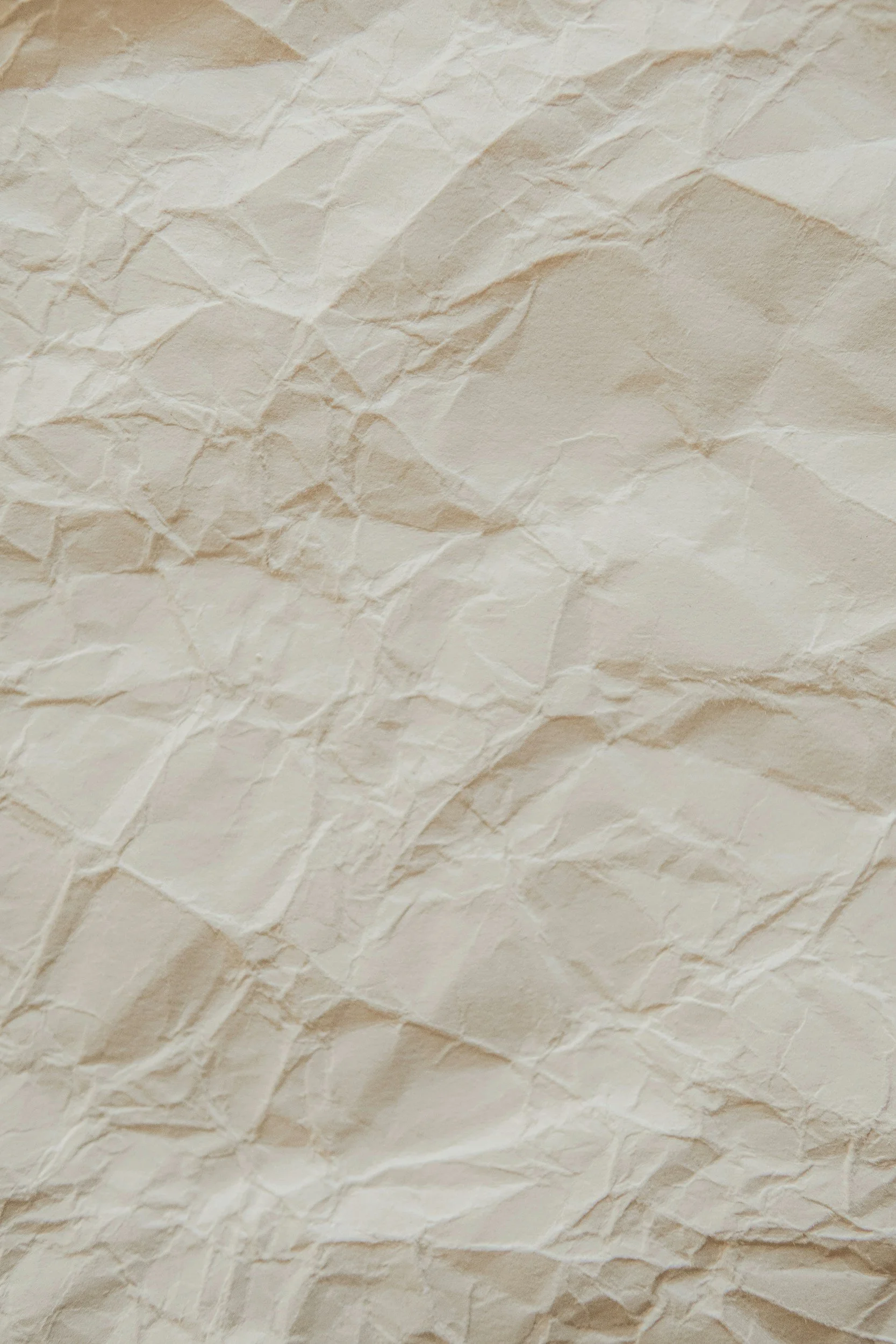
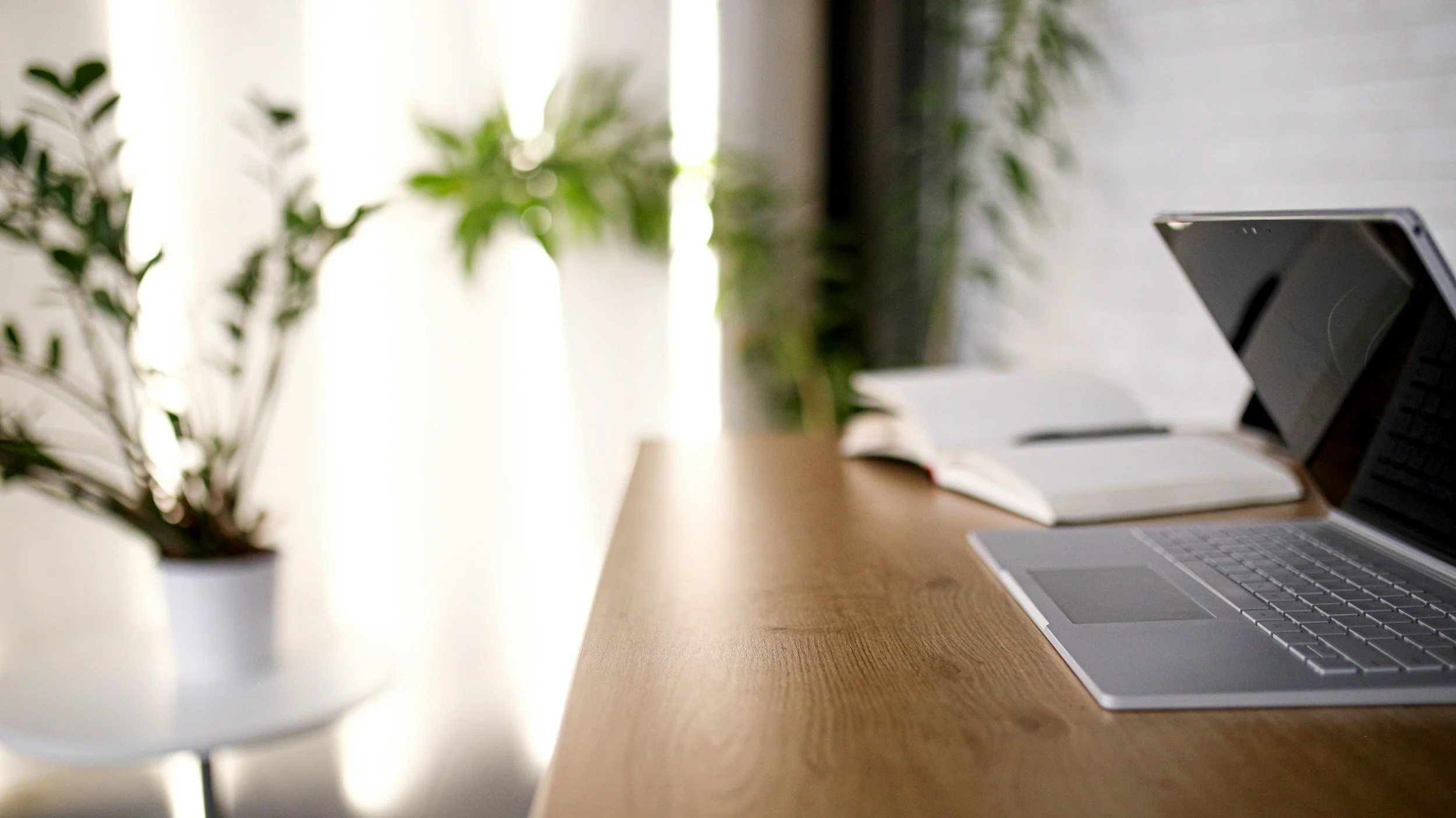
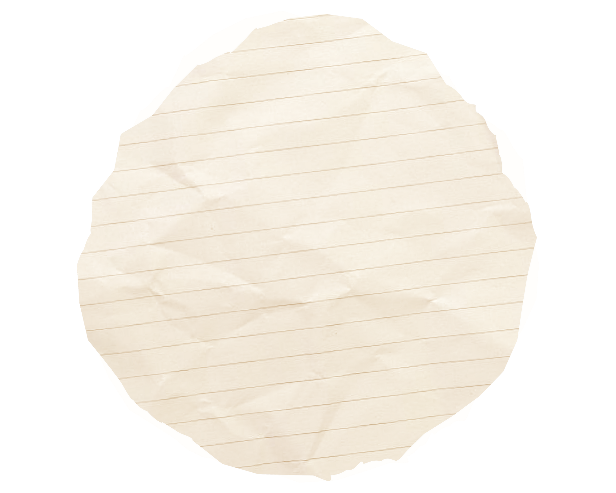
Textures & Textured Backgrounds
What it is: Instead of flat blocks of colour for backgrounds and sections, we are now seeing subtle texture - canvas effects, parchment paper, gentle grain and organic patterns. It adds visual interest and warmth without being distracting.
Why it's happening now: As we've moved away from ultra-minimal flat design, there's a desire for websites to feel more tactile and less screen-like. Texture adds depth and makes digital spaces feel more human and handcrafted.
Should you care? This is one of those low-risk trends worth trying. Subtle texture can make your website feel more sophisticated and polished without requiring a complete rebuild. The key word is subtle - we're not talking about obvious patterns that compete with your content, just enough texture to add warmth.
Real-world application: A heritage brand or artisan business could use canvas or linen textures to reinforce their craft positioning. A consultancy might use very subtle paper grain to add sophistication without being flashy. A creative service provider could use organic, hand-drawn textures that reflect their artistic approach.
The trick is ensuring texture enhances readability rather than fighting with your text. If your content becomes harder to read, the texture's too strong. Also check it doesn't slow down your loading speed. professionalism and creativity.
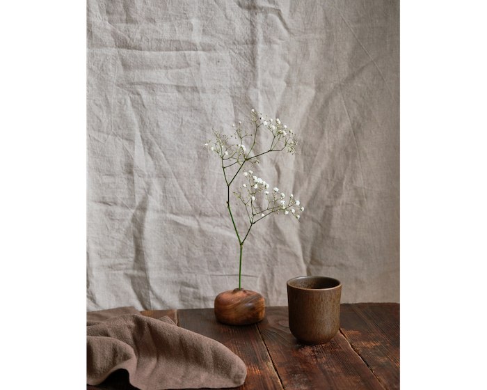

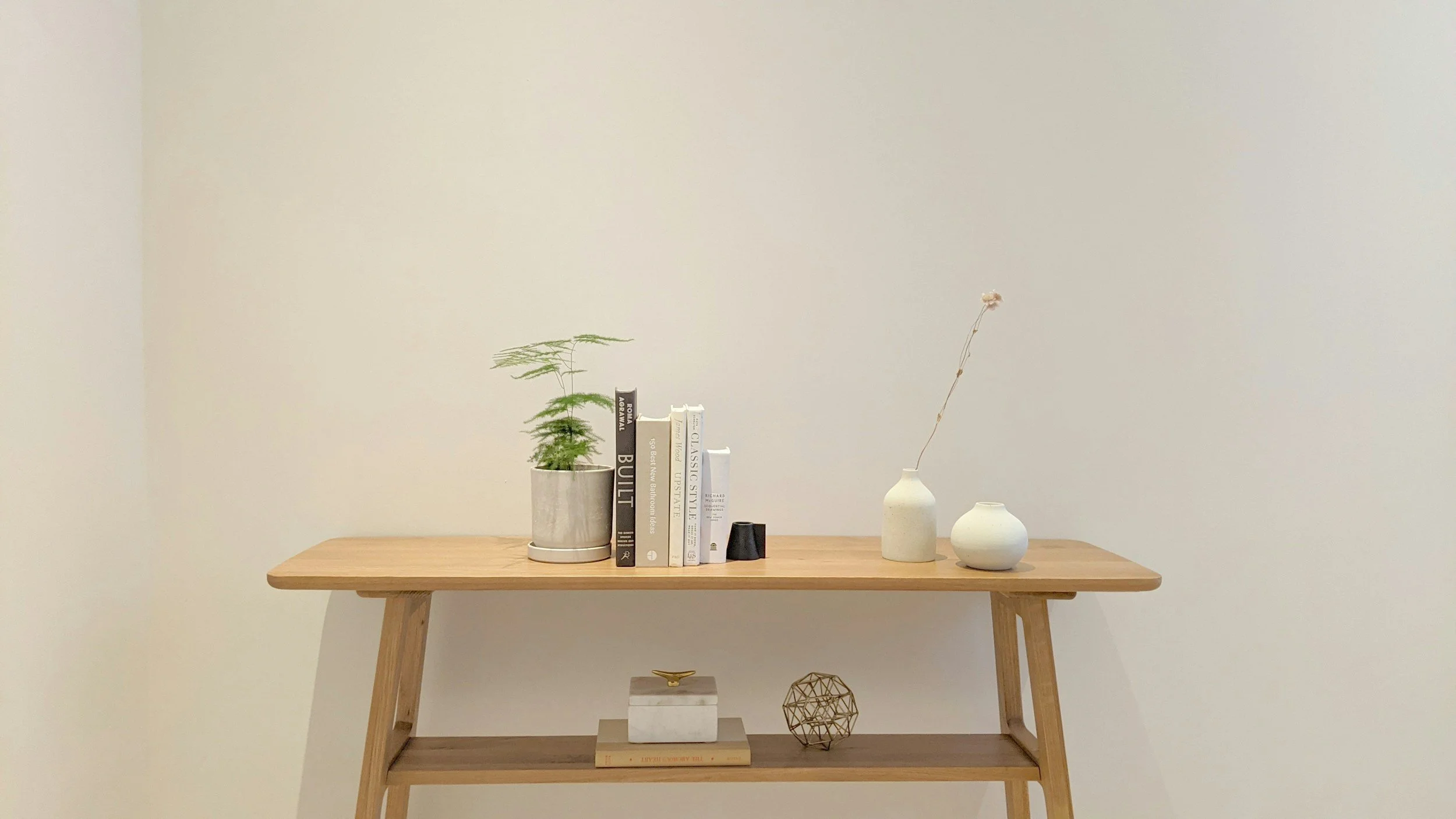
Beige is the New White
What it is: Stark white backgrounds are being replaced by warmer, softer neutrals - beiges, creams, warm greys, and off-whites. The overall effect is calmer, more inviting and less clinical.
Why it's happening now: White backgrounds can feel harsh and cold, especially on bright screens. As we spend more time on devices, there's a move toward colours that are easier on the eyes and feel more welcoming. It's part of that broader shift toward warmth and comfort in our digital spaces.
Should you care? This is actually quite a smart move for many service businesses. Beige and warm neutral backgrounds can make your website feel more approachable and premium at the same time - which is exactly what many consultants, coaches and creative professionals strive for.
It's also more forgiving - white backgrounds can make colour choices and imagery feel stark, whereas warm neutrals give you more flexibility and create natural harmony.
Real-world application: Almost any service-based business can benefit from this shift. A career coach moving from white to warm cream instantly feels more approachable. A business consultant using soft beige rather than white comes across as sophisticated rather than corporate.
This is something I have always leaned into, as a designer. See any of my portfolio examples, and you’ll notice there is very little pure white anywhere.
The exception? If your brand is genuinely about energy, brightness, and vibrancy - think children's services, certain fitness brands - then using white within your palette is a good fit.
Swapping white for warm neutrals is one of the easiest updates you can make to modernise your website. It's subtle enough that it won't confuse existing clients, but fresh enough to signal that you're current.

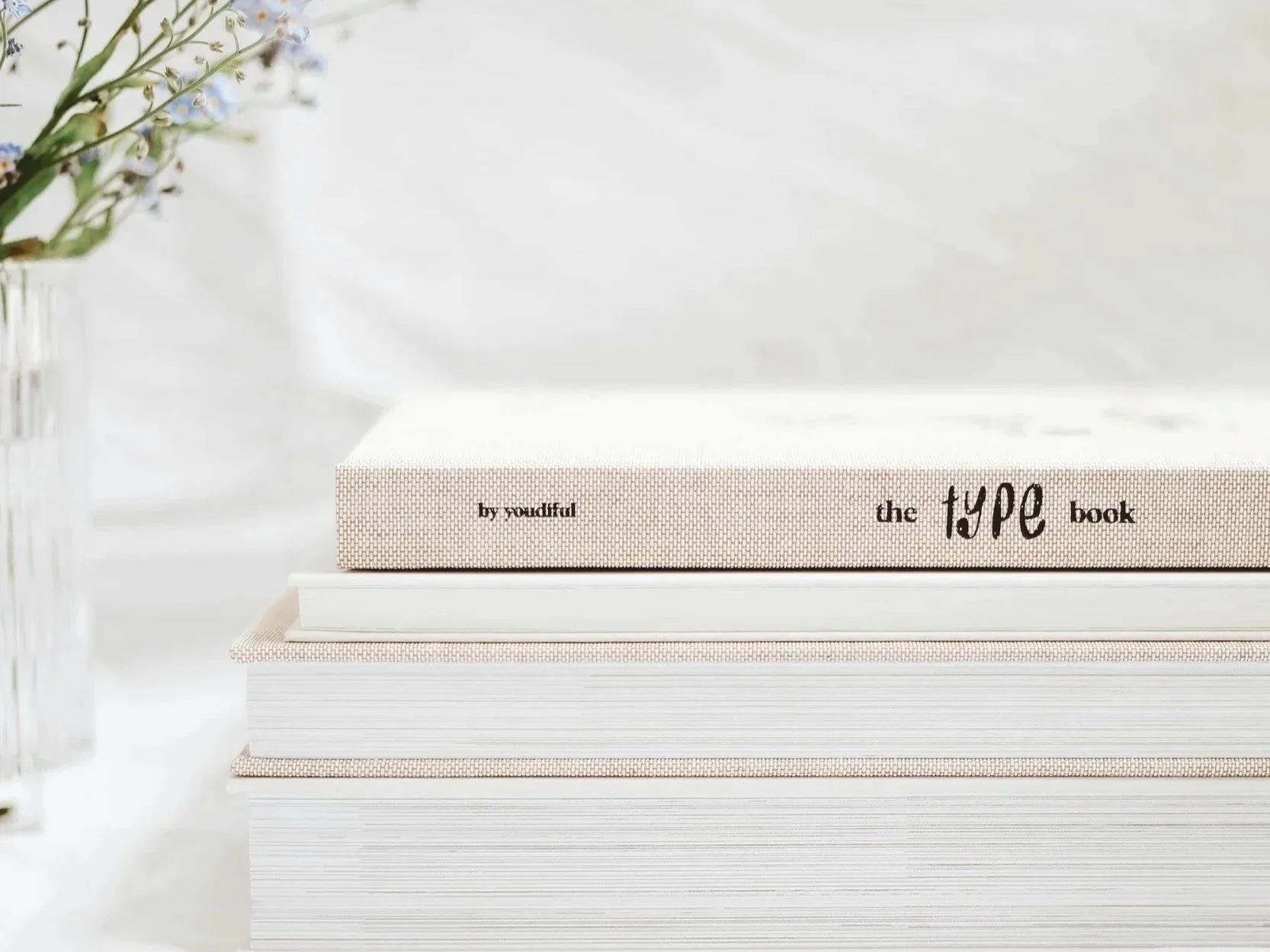
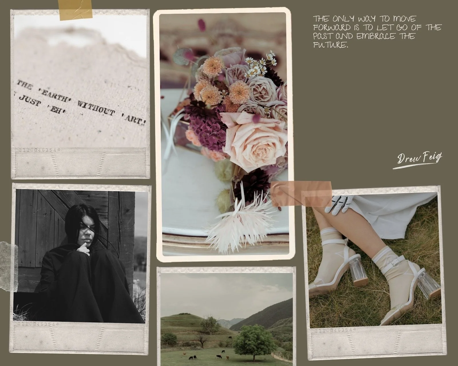
Nostalgia & Heritage
What it is: Design elements that evoke different time periods - vintage typography, retro colour palettes, classic layouts, heritage-style photography. It's about creating a sense of timelessness and established quality rather than chasing the cutting edge.
Why it's happening now: In an age of rapid change and AI everything, there's comfort in things that feel rooted and lasting. Heritage design signals authenticity, craft, and trustworthiness - all qualities people are craving right now.
Should you care? Only if it genuinely fits your brand story. This trend works beautifully for businesses with actual heritage, artisan services, or brands that position themselves around tradition, quality, and timelessness.
But if you're a tech startup or innovation-focused business, trying to force a vintage aesthetic would send completely the wrong message.
Real-world application: A family-run business could lean into their actual heritage with vintage-inspired design elements. A craftsperson or maker would benefit from this aesthetic. A consultancy that specialises in tried-and-tested methods rather than trendy frameworks could use heritage design to reinforce their "wisdom over fad" positioning.
I'd even argue that some wellness practitioners could use this approach - particularly if they focus on ancient practices or time-tested modalities.
What it's not: It's not about making your website look old-fashioned or literally recreating 1970s design. It's about borrowing elements - a classic font pairing, a muted vintage colour palette, thoughtful layout - that evoke quality and permanence.
Bottom line: Heritage design can be incredibly powerful if it aligns with your actual brand story and values. Don't fake it - but if you genuinely have a story about tradition, craft, or timelessness, this aesthetic can communicate that beautifully.
Folding Over Section Movement
What it is: As you scroll down the page, sections appear to overlap or "fold over" each other, creating depth and visual interest. Instead of a flat vertical scroll, there's a sense of layers and dimension.
Why it's happening now: We're seeing a general move away from boring, predictable scrolling experiences. This technique adds a bit of delight and sophistication without being gimmicky or overwhelming.
Should you care? This is more of a "nice to have" than a necessity. It can make your website feel more polished and contemporary, but it won't fix fundamental problems with your messaging or conversion strategy.
If you're building a new website or doing a significant redesign, it's worth considering. If your current site works well, it's not worth a rebuild just for this effect.
Real-world application: This works particularly well for creative businesses, designers, or premium service providers where the website itself is part of demonstrating your attention to detail and quality.
A photographer or interior designer could use this effect to create a more gallery-like, immersive experience. A brand strategist might use it to make their own site feel more considered and sophisticated.
The caveat: It needs to be done well. Badly executed, it can slow down your site or create confusing scrolling behaviour. And it absolutely must work perfectly on mobile - if the effect breaks down on phones, it's worse than not having it at all.
Bottom line: This is a polish-level enhancement, not a fundamental requirement. If your website platform supports it easily and it fits your brand aesthetic, go for it. But don't rebuild your site just for this effect, and make sure it doesn't compromise loading speed..

The Trends You Can Safely Ignore (For Now)
Ulitimately, design is subjective. What works brilliantly for one brand might fall flat for another. But if you're a service-based business wondering where to focus your energy and budget, here are a few aesthetic trends getting attention that probably aren't the best fit - at least not right now:
Maximal, chaotic layouts You'll see this in fashion editorials and certain creative agency portfolios - overlapping elements, clashing colours, intentionally chaotic compositions. It makes a bold statement, but for most service businesses, clarity trumps chaos. If potential clients can't quickly understand what you do, the experimental layout has failed its primary job.
Extreme experimental typography Text that warps, rotates, or requires genuine effort to read. Again, this can work beautifully when done subtly. But if you need people to actually read your services, your testimonials, or your about page? Readability matters more than being cutting-edge.
Full nostalgia commitment While heritage elements can add sophistication (see trend 4), going full vintage - complete with deliberate pixelation, exaggerated grain, or overly retro colour schemes - can date quickly and might confuse your audience about whether your business is actually current.
These aren't "bad" trends - they're just trends that serve specific purposes for specific brands. If you're a mainstream service provider, consultant or coach, they're probably not where you should invest your redesign budget.


What Actually Matters More Than Trends?
Before you redesign your website to adopt any aesthetic trend, it's worth stepping back and asking some more fundamental questions:
Because here's the truth: a beautifully trendy website that doesn't serve your business is just expensive decoration.
Does your website clearly communicate what you do and who you help? This is the foundation. If a stranger lands on your homepage, can they understand within 5-10 seconds what problem you solve and whether you're relevant to them? No colour palette or textured background will fix unclear messaging. Get this right first.
Does the design authentically reflect your brand? Your website should feel like you, not like a collection of trendy elements you've borrowed because they looked good elsewhere. If moody saturated tones don't match your genuine energy, they'll feel forced. If your brand is naturally warm and approachable, beige might feel more right than stark white - but only if it's true to who you are.
Does it work flawlessly on mobile? More than half your visitors are on phones. Beautiful desktop designs that break down on mobile are actively costing you business. Textured backgrounds, overlapping sections, heritage typography - they all need to work perfectly on smaller screens.
Does it load quickly? Rich imagery and beautiful textures mean nothing if your site takes 6+ seconds to load. People leave. They don't wait, they don't give you the benefit of the doubt - they just go elsewhere. Speed isn't glamorous, but it's non-negotiable.
Does it convert visitors into enquiries? Ultimately, your website exists to support your business. Are your calls-to-action clear? Can people easily take the next step, whether that's booking a call, requesting a quote, or downloading a resource? A "trendy" design that doesn't convert is worse than a simple, clear design that does.
Is it maintainable? Can you (or your team) easily update it? Add new content? Make seasonal changes? A website that requires a designer's intervention for every small edit becomes a bottleneck for your business, no matter how beautiful it looks.
The aesthetic trends we've covered - the moody tones, the textures, the heritage elements - these can genuinely enhance how your brand is perceived if the fundamentals are already solid. But they can't compensate for unclear messaging, slow loading, or poor user experience.
Get the foundations right first. Then layer on the aesthetic polish that feels authentically you.
Final Thoughts
|
Final Thoughts |
Web design trends come and go, but a website that authentically represents your brand and serves your business goals never goes out of style.
The aesthetic trends happening in 2026 are generally moving toward warmth, richness, and depth - away from the stark minimalism of recent years. That's genuinely good news for many service businesses, because these warmer, more textured approaches tend to feel more inviting and human.
But here's what I want you to remember: you don't have to follow every trend. You don't even have to follow any trend if they don't suit your brand.
The best approach? Stay aware of what's happening in the design world, borrow elements that genuinely enhance how you want to be perceived, and confidently ignore the rest. Your website should look current, yes - but more importantly, it should look and feel like you.
Ready to Refresh Your Website?
If you're looking at your website right now and wondering whether it still represents your brand well, or whether it's time for an update, I can help.
Not sure where to start? My Website Clarity Session is a focused 90-minute intensive where we'll audit your current site, identify what's working (and what's not), and create a practical action plan. It's perfect if you need expert eyes on your website but aren't ready for a full rebuild. £397
Ready for a streamlined refresh? The Smart Start Package is designed for service providers who need a professional, conversion-focused website without the lengthy timeline or premium price tag. We'll get you a polished Squarespace site that works hard for your business. Starting at [your price]
Want the full experience? My Signature Site service is for established businesses ready to invest in a premium, bespoke website that perfectly reflects your brand and converts your ideal clients. This is the comprehensive option with strategic messaging, custom design, and all the bells and whistles. Starting at [your price]
Not sure which is right for you? Get in touch and let's have a conversation about where you are and where you want to be.
Because the goal isn't to have the trendiest website. It's to have a website that feels authentically you, serves your business goals and works hard for you every single day.
And that? That never goes out of fashion.
FAQs
-
Squarespace is one of the leading Content Web Platforms globally, with exceptional customer service. We have chosen to use this platform because, not only does it have all the tools needed to create stunning and effective sites, but it has a very simple interface, making it suitable for anyone to use. This means we can keep costs down for clients who want to run their own site, post-launch. We do offer maintenance support for those who would like it. Squarespace is highly secure and fully managed, meaning updates are automatic and without disruption.
-
Basically, all packages are fully bespoke to the individual client. We will spend time with you during the discovery phase, ensuring we are scoping and cultivating the right project. This will allow us to create a high-calibre website that matches your requirements and enhances your business. We are a value-driven business, as apposed to cost-driven, so we make sure our packages are comprehensive and include everything you need, whilst keeping costs down. To date, we have a full track record in exceeding customer expectations. Most of our work is through referrals. Please do get in touch for an informal chat, if you’d like to know more.
-
Yes we can! We are specialists in creating content / copywriting and would be delighted to help you with this. Whether it’s copy editing existing wording, or starting from the ground up, we can discuss it during the discovery phase and incorporate into the project, where appropriate.
Regarding images, we have photographer contacts we can recommend, and can put you in touch with them to discuss your requirements. We would then work closely with them during the project, for continuity. Squarespace also has an extensive library, both free and paid, of high quality stock images that can help if needed.
-
Once we have all we need from you the client (images and content, if we’re not providing this), we generally allow 2 weeks build time. We will agree a start date with you early on, if this helps you, so you can plan timings your end. We can also schedule projects in advance, so there’s complete flexibility.
-
Once we have completed an initial discovery call, we will put together a proposal of work, which will include timescales and costs. Then, if you would like to proceed, we ask for 50% of project cost in advance, to secure your start date, and then the remaining 50% on completion.
-
We have a number of clients who would be more than happy to briefly chat about the success of their project with Blue Fern Consult. Please enquire and we can set this up.
Client Feedback
“Before the project started, I felt overwhelmed with running my website and marketing - I didn’t know how to move forward.
Emily quickly identified a plan to create a website that would support my business, and one that works! I have been delighted with the service provided, thank you.”
“I needed to grow my sales and branch out of social media selling. Emily turned my many creative ideas into a beautiful E-commerce website that has transformed my business.
From clever design features, colours, font suggestions, to well written copy, Emily really is the whole package.”
“Emily was professional, efficient and concise. She understood immediately the kind of look I wanted for my website.
Additional edits were done incredibly promptly and guidance throughout the process was impeccable. I cannot recommend Emily highly enough.”